


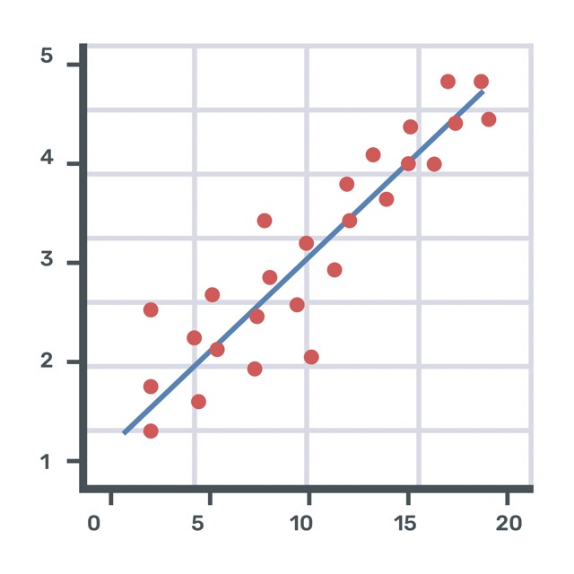
A graph of the points representing a collection of data.
A scatter plot is a type of graph used to show the relationship between two sets of data. Each dot on the graph represents one pair of related values: one for each axis (x and y).
We use scatter plots to:
-
Look for patterns in data
-
Show trends or relationships
-
Spot outliers (data points that are very different from the rest)
For example, a scatter plot could show:
-
The height and age of students in a class
-
The number of hours studied and the score on a test
-
The outside temperature and the number of ice creams sold
If the dots form a line or pattern, it tells us that the two sets of data might be related.
When Do Students Learn About Scatter Plots?
Students are introduced to scatter plots when they begin analyzing and displaying data using coordinate graphs.
Grades 6–8 – Introduction to Scatter Plots
Students create and interpret scatter plots to understand relationships between two variables and explore concepts like correlation.
Grades 9+ – Analyzing Data Using Scatter Plots
Students use scatter plots in statistics and algebra to examine trends, fit lines of best fit, and interpret real-world data.